Stylers of SureCart Elements
The goal is to improve the design customization options for SureCart's elements within the Bricks editor. We've upgraded the controls for 5 key elements of the SureCart. These enhancements automatically apply when you activate the SureBricks addon, giving you more design flexibility in the Bricks editor.
By refining the element controls, users can:
- Save Time – Reduce the steps needed to adjust styling, layouts, and functionality.
- Simplify Customization – Make it intuitive for users to modify the appearance (e.g., colors, typography, spacing) without manual coding.
- Streamline Workflow – Ensure all key design settings (e.g., buttons, forms, checkout sections) are easily accessible in the Bricks UI.
1. Cart Toggle Icon Element
Checkout the difference between before and after images.
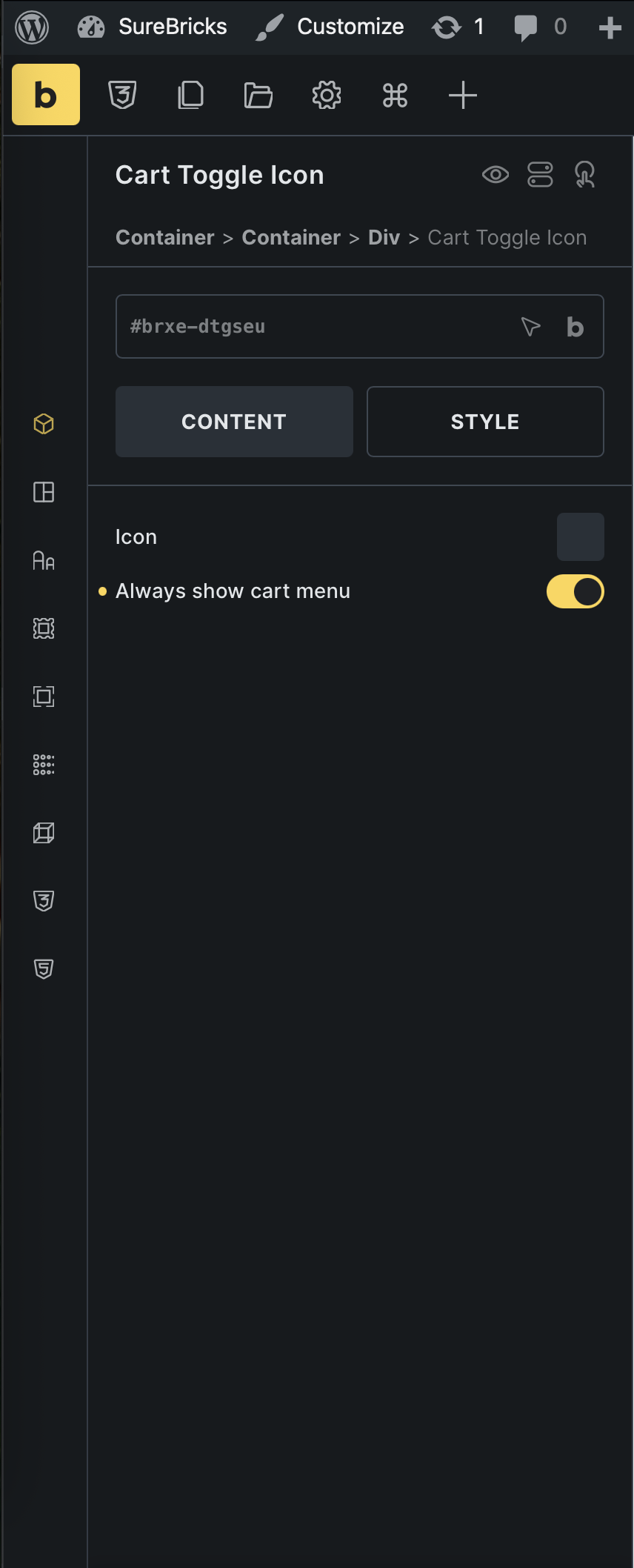
Default(SureCart Element)
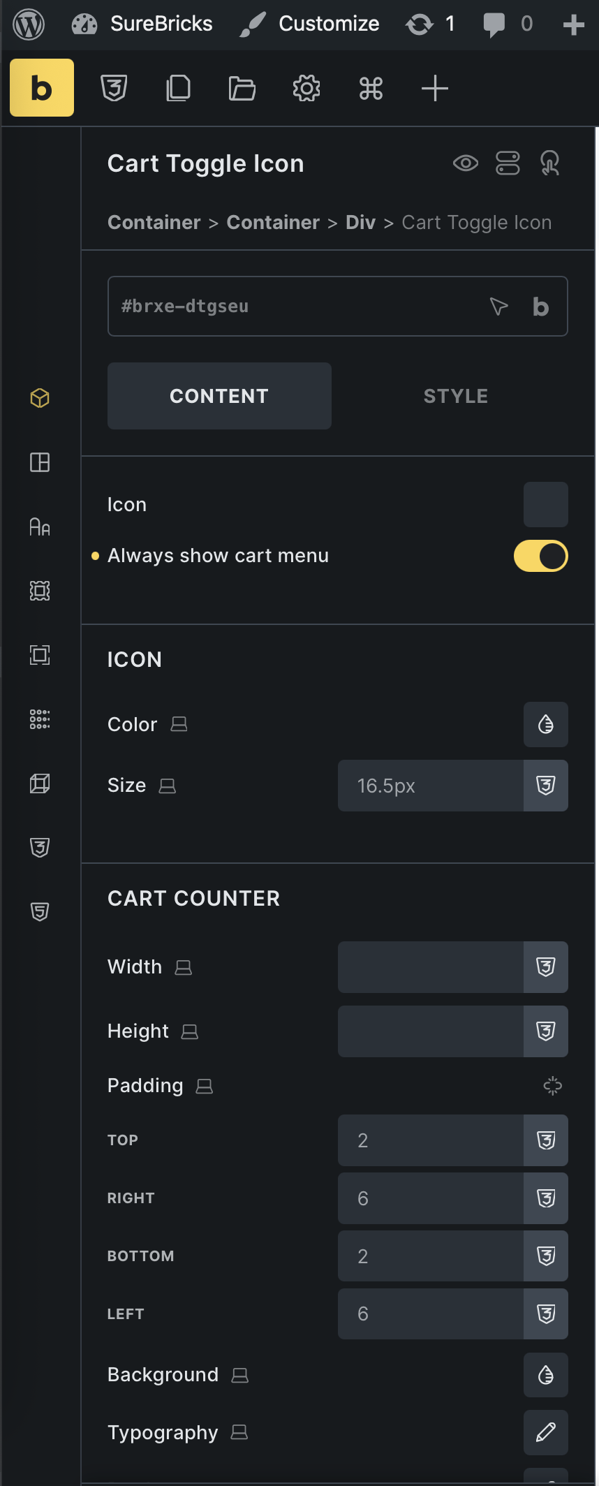
After(With SureBricks Addon)
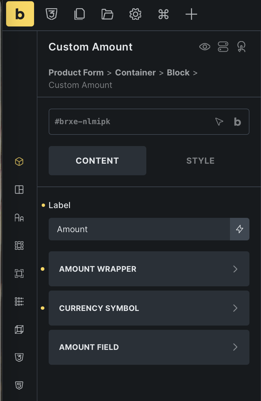
2. Custom Amount Element
Checkout the difference between before and after images.

Default(SureCart Element)
After(With SureBricks Addon)
3. Quantity Element
Checkout the difference between before and after images.
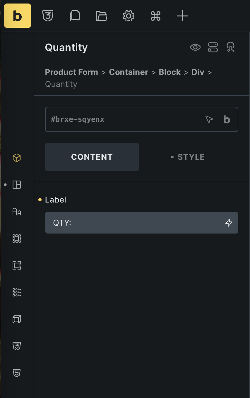
Default(SureCart Element)

After(With SureBricks Addon)
4. Sale Badge Element
Checkout the difference between before and after images.
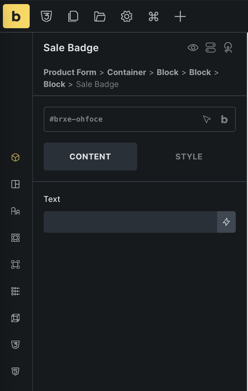
Default(SureCart Element)
After(With SureBricks Addon)
5. Variant Pill(s) Element
Checkout the difference between before and after image.
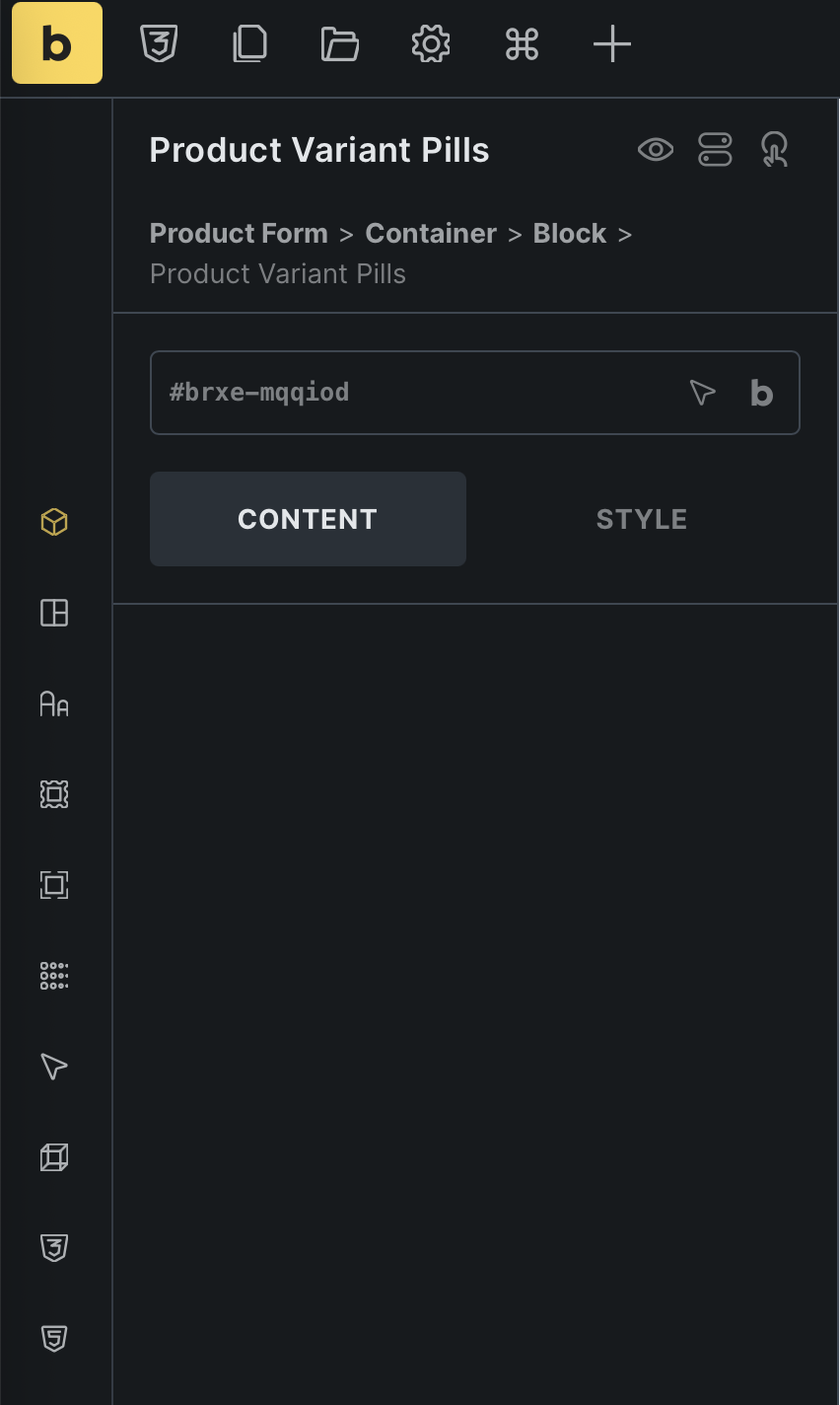
Default(SureCart Element)
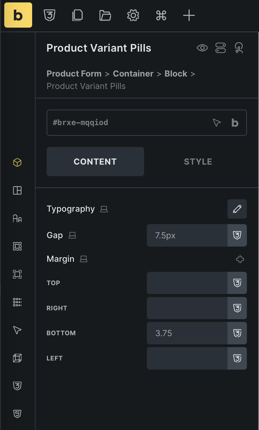
After(With SureBricks Addon)
Tips & tricks: If you don't need them, you can disable them by toggling the switch button here (Bricks -> SureBricks -> MISC).
