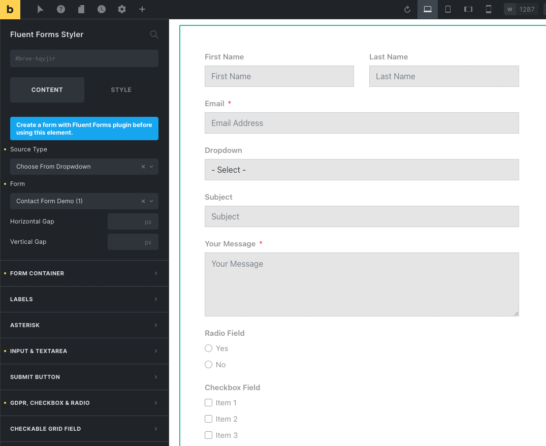
The Fluent Form Styler element gives you the full controls for styling. It covers up the maximum field types of the Fluent Form plugin and you can add/edit the default’s color, spacing, fonts, width, size, etc. from the builder editor.
Minimum Requirement:
- Fluent Form Plugin
You customize the following field type:
- Form container
- Labels
- Placeholder text
- Input fields
- Checkboxes
- Radio buttons
- GDPR
- Terms
- Submit Button
- Select box
- Checkbox/Radio Photo
- Checkable Grid
- File Upload
- Rating
- Form Step
- Payment Summary
- Repeater
- Net Promoter Score
- Section Break
- Success Message
- Validation Message
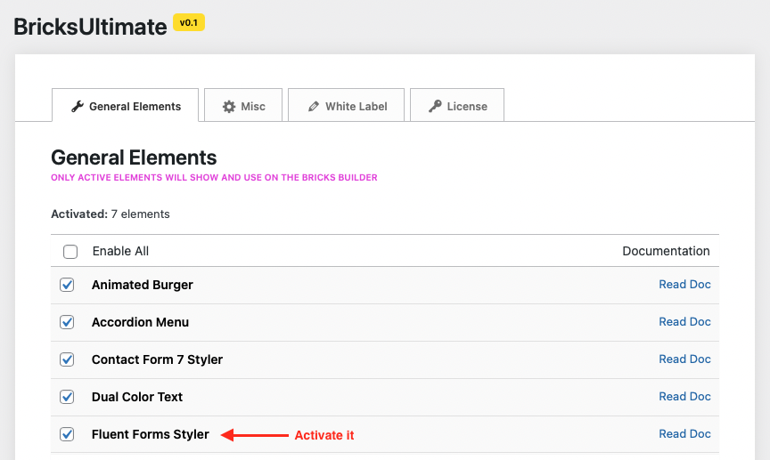
Activate The Element
By default this element is disabled. At first, you will activate the Fluent Form Styler element after going to your Dashboard -> Bricks -> BricksUltimate -> General Elements page. Under the general elements tab, you will get the elements list. Checkmark the Fluent Form Styler element and save the settings.
How To Use
Make sure that you already installed, and activated the Fluent Forms plugin, and created a form with it. Open the builder editor and add the Fluent Form Styler element. You will select the form from the dropdown list and the selected form will show on the builder editor. Now you can change the color, fonts, spacing, size, etc. from the settings panel and quickly customize the layout.
Dynamically Show the Form
Sometimes we shall fetch the form dynamically based on a custom field value. Assume that you created a template for a single details page and show the different form(s) based on the custom field value. Select the source type “Custom Field” and enter the custom field name into the input box. You can use the ACF, PODs, MetaBox, or any other plugin and make the custom field. Make sure that your custom field is returning the Fluent Form’s ID.