Bricks added some inbuilt styles for the button element. But you can extend those list and add more styles as per your mind. I am sharing the instructions below on how you can do it.
[edd_restrict id=”12,14″ message=”If you want to view the rest of the content, you need to buy the BricksUltimate add-on. Users of the BricksUltimate will view this content after login.”]
Registering new styles
There has a filter bricks/setup/control_options so you can easily overwrite the existing options. Open the functions.php file of the Bricks child theme and add this PHP code there.
add_filter( 'bricks/setup/control_options', 'bu_add_more_button_styles', 10 );
function bu_add_more_button_styles( $control_options ) {
	$control_options['styles']['grey'] = esc_html__( 'Grey', 'bricks' );
	$control_options['styles']['red'] = esc_html__( 'Red', 'bricks' );

	return $control_options;
}
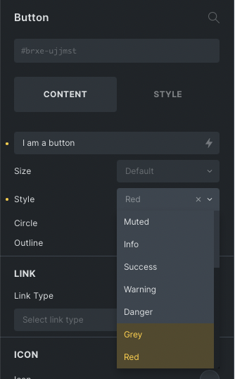
This code will add two new styles: Grey and Red.
Add default style
Navigate to Dashboard -> Bricks -> Settings -> Custom code tab and drop this small CSS in Custom CSS text box.
.bricks-background-grey {
  background-color: #bebebe;
  color: #fff;
}

.bricks-background-red {
  background-color: #990000;
  color: #fff;
}
Add Theme Styles
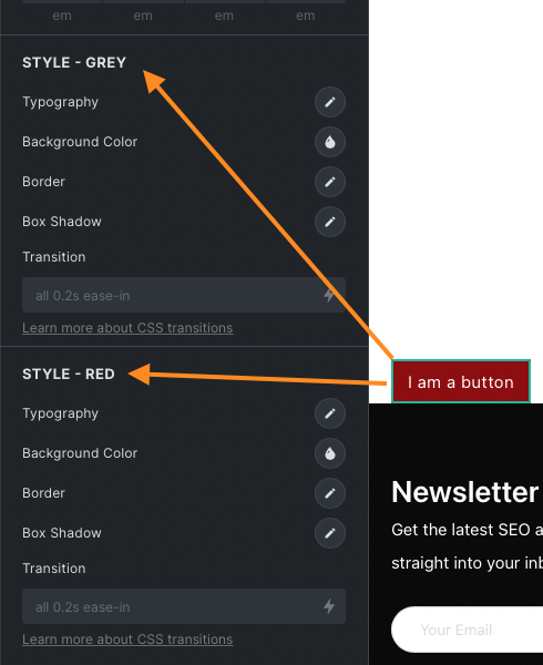
Now we shall these new button styles to theme styles. Open the functions.php file of the bricks child theme and add the following code:
dd_filter( 'bricks/theme_styles/controls', 'bu_set_new_styles_controls' );
function bu_set_new_styles_controls( $controls ) {

	//* style for grey
	$controls['button']['sepGrey'] = [
		'group' 	=> 'button',
		'label'  	=> esc_html__( 'Style - Grey', 'bricks' ),
		'type'   	=> 'separator',
	];

	$controls['button']['greyTypography'] = [
		'group' => 'button',
		'type'  => 'typography',
		'label' => esc_html__( 'Typography', 'bricks' ),
		'css'   => [
			[
				'property' => 'font',
				'selector' => '.bricks-button.bricks-background-grey',
			],
		],
	];

	$controls['button']['greyBackground'] = [
		'group' => 'button',
		'type'  => 'color',
		'label' => esc_html__( 'Background color', 'bricks' ),
		'css'   => [
			[
				'property' => 'background-color',
				'selector' => '.bricks-button.bricks-background-grey',
			],
		],
	];

	$controls['button']['greyBorder'] = [
		'group' => 'button',
		'type'  => 'border',
		'label' => esc_html__( 'Border', 'bricks' ),
		'css'   => [
			[
				'property' => 'border',
				'selector' => '.bricks-button.bricks-background-grey',
			],
		],
	];

	$controls['button']['greyBoxShadow'] = [
		'group' => 'button',
		'type'  => 'box-shadow',
		'label' => esc_html__( 'Box shadow', 'bricks' ),
		'css'   => [
			[
				'property' => 'box-shadow',
				'selector' => '.bricks-button.bricks-background-grey',
			],
		],
	];

	$controls['button']['greyTransition'] = [
		'group' => 'button',
		'label' => esc_html__( 'Transition', 'bricks' ),
		'css'   => [
			[
				'property' => 'transition',
				'selector' => '.bricks-button.bricks-background-grey',
			],
		],
		'type'        => 'text',
		'placeholder' => 'all 0.2s ease-in',
		'description' => sprintf( '<a href="https://developer.mozilla.org/en-US/docs/Web/CSS/CSS_Transitions/Using_CSS_transitions" target="_blank">%s</a>', esc_html__( 'Learn more about CSS transitions', 'bricks' ) ),
	];

	//* style for red
	$controls['button']['sepRed'] = [
		'group' 	=> 'button',
		'label'  	=> esc_html__( 'Style - Red', 'bricks' ),
		'type'   	=> 'separator',
	];

	$controls['button']['redTypography'] = [
		'group' => 'button',
		'type'  => 'typography',
		'label' => esc_html__( 'Typography', 'bricks' ),
		'css'   => [
			[
				'property' => 'font',
				'selector' => '.bricks-button.bricks-background-red',
			],
		],
	];

	$controls['button']['redBackground'] = [
		'group' => 'button',
		'type'  => 'color',
		'label' => esc_html__( 'Background color', 'bricks' ),
		'css'   => [
			[
				'property' => 'background-color',
				'selector' => '.bricks-button.bricks-background-red',
			],
		],
	];

	$controls['button']['redBorder'] = [
		'group' => 'button',
		'type'  => 'border',
		'label' => esc_html__( 'Border', 'bricks' ),
		'css'   => [
			[
				'property' => 'border',
				'selector' => '.bricks-button.bricks-background-red',
			],
		],
	];

	$controls['button']['redBoxShadow'] = [
		'group' => 'button',
		'type'  => 'box-shadow',
		'label' => esc_html__( 'Box shadow', 'bricks' ),
		'css'   => [
			[
				'property' => 'box-shadow',
				'selector' => '.bricks-button.bricks-background-red',
			],
		],
	];

	$controls['button']['redTransition'] = [
		'group' => 'button',
		'label' => esc_html__( 'Transition', 'bricks' ),
		'css'   => [
			[
				'property' => 'transition',
				'selector' => '.bricks-button.bricks-background-red',
			],
		],
		'type'        => 'text',
		'placeholder' => 'all 0.2s ease-in',
		'description' => sprintf( '<a href="https://developer.mozilla.org/en-US/docs/Web/CSS/CSS_Transitions/Using_CSS_transitions" target="_blank">%s</a>', esc_html__( 'Learn more about CSS transitions', 'bricks' ) ),
	];


	return $controls;
}
We are done here. Now open the builder editor and you will get new styles for button.[/edd_restrict]


